Carta Carry
Moving the Venture Capital back office from the desktop to the pocket. As the sole designer, I owned the mobile experience from first concept through launch, partnering with product and engineering to prioritize the workflows GPs needed away from their desks. 0→1 in four months.
Overview
Running a fund only worked from a desk. Approving a capital call, releasing a wire, checking who has paid: none of it hard, all of it waited for a laptop. Carta Carry puts the fund in the GP's pocket.
I led design from a deliberately rough first experiment with thirty GPs to a shipped app in four months. Month-over-month retention of GPs went from 35% at launch to 65% by early 2026, and it holds a 4.9★ rating on the App Store.
The home screen. What’s active, what needs you.
Where it started
Carry didn't begin as a mobile project. The brief was speed: fund admin requests on the web took too long, and we were looking for ways to shorten them. The lead came from Carta Mobile. It was built for employees managing their equity and gave investors very little, fund information and performance, yet the data showed them coming back to it anyway, just to look. Nobody was running a fund from a phone. But they were already checking on one there, and that was a habit worth building on.
So the question changed: not how to make the web faster, but what fund admin would look like if it started from the phone. Since nobody knew which parts belonged there, I kept the first version deliberately unstructured. Choose a request, and it opens a thread with the fund admin team. A polished guess is harder to walk back than a plain one, so the first release was a listening tool. We put it in front of about thirty beta GPs and let the requests tell us what the product was.
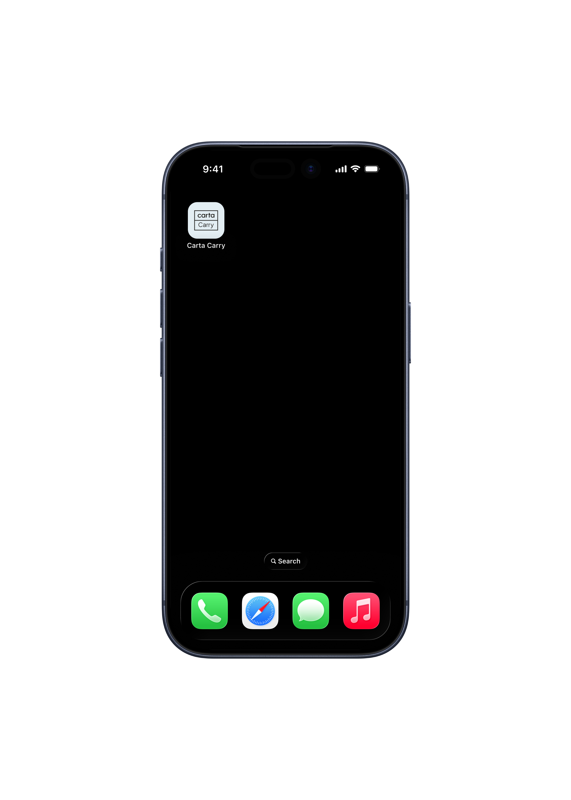
Carry on the home screen.
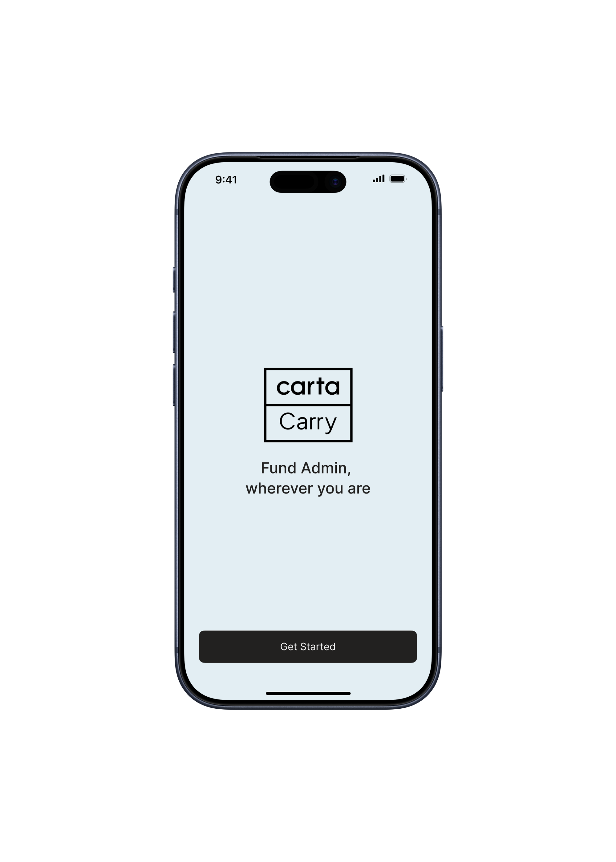
The welcome screen.
The design challenge
A pattern showed up in the threads. Some requests came back with the same shape every time: capital calls, management fees, expenses. The routine machinery of a fund. The rest stayed one-off and high-stakes, the kind that needs a person. That split was the whole insight. The question was never how to automate fund admin. It was which parts not to automate. The routine wanted a fast, structured flow. The messy wanted a human, close by.
Fund admin isn't complicated the way chess is complicated. It's complicated the way moving house is complicated: lots of pieces, lots of people, hard deadlines, real money. The job was to make the repeatable parts effortless on a six-inch screen without flattening the complexity or hiding what a GP needs in order to decide.
The first instinct was a bot. A GP types a request, something answers. I explored it early and dropped it: a bot needs the full context of a fund to answer well, and in fund admin a confident wrong answer costs real money. So the request went to a person instead, and the routine got a structured flow around it. The name changed with the product. Concierge described the request line. Carry described the fund: carried interest, and the work of carrying it.
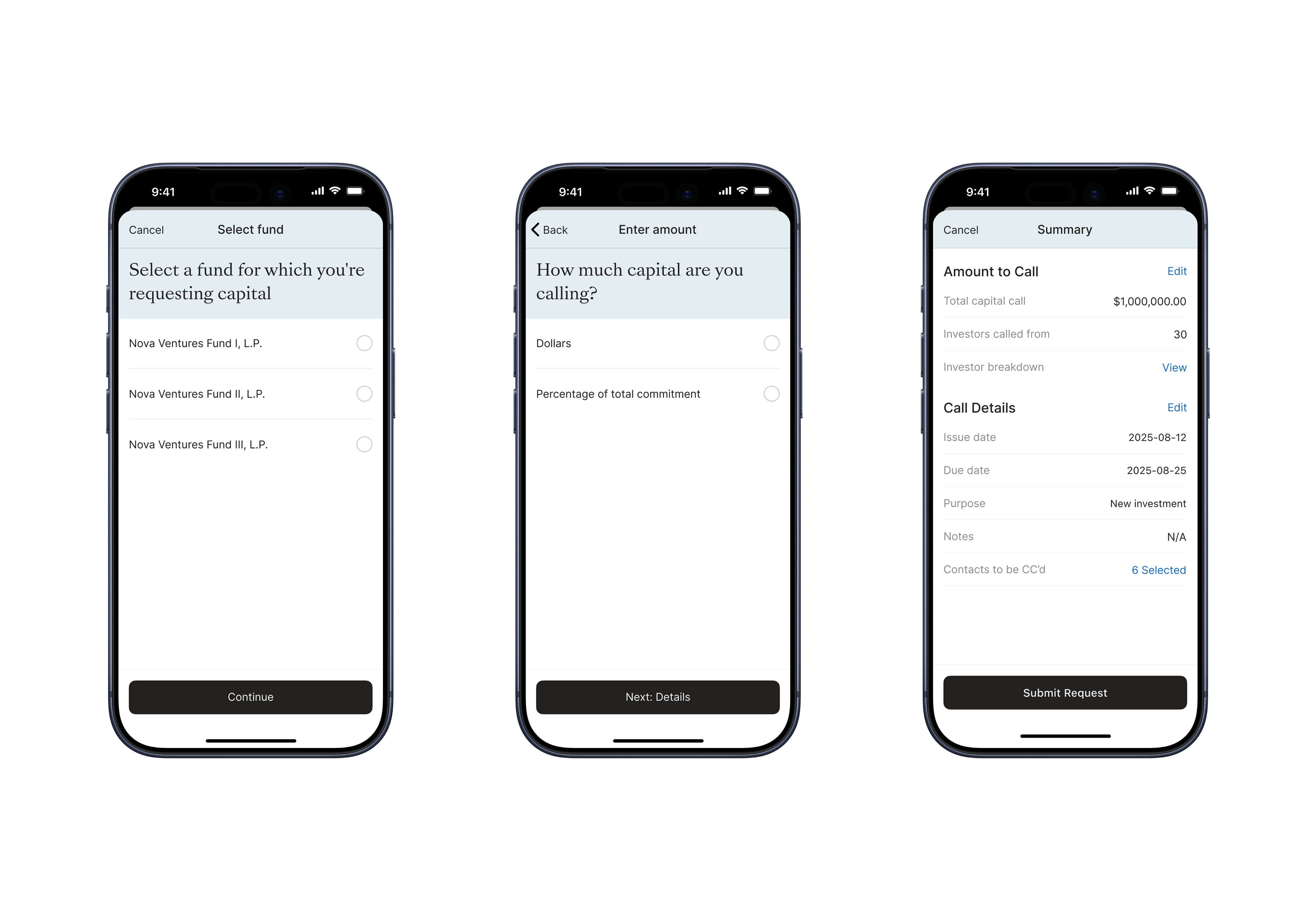
Requesting a capital call: fund, amount, summary.
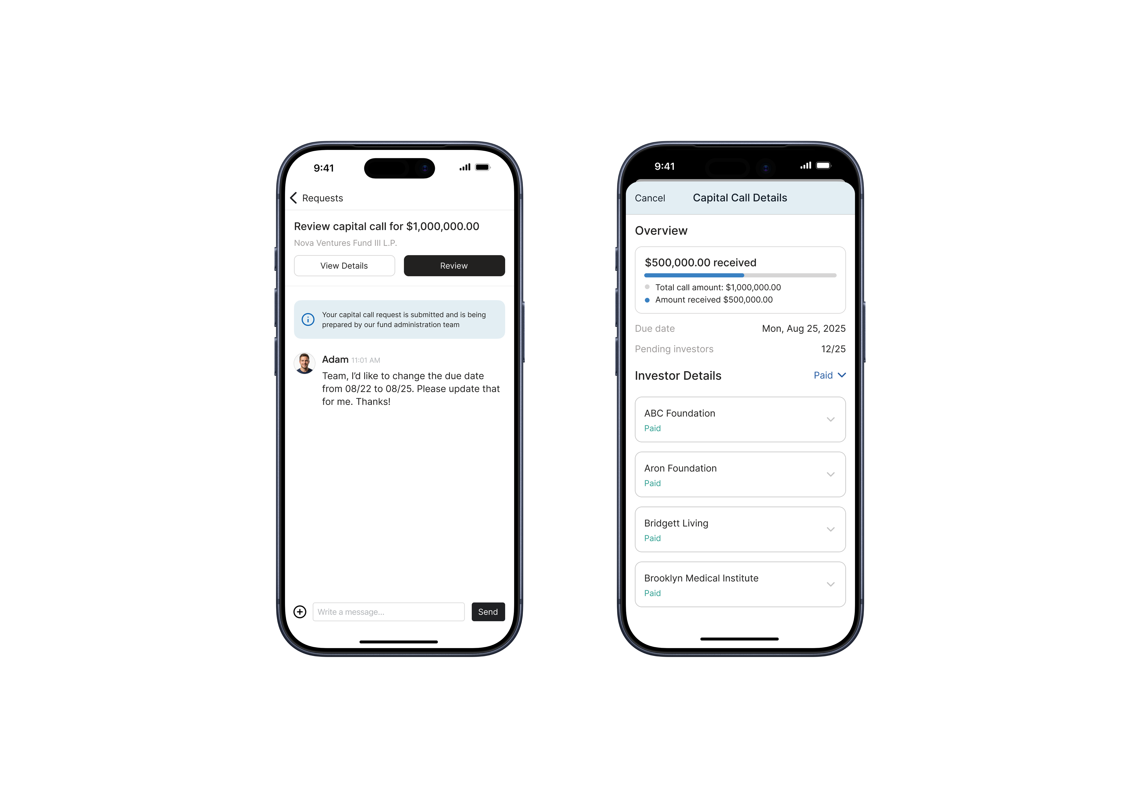
Reviewing a capital call, with the fund admin thread alongside.
What it grew into
Four taps, anywhere, and beside them a thread for anything that needs a person. The fast path and the human path, side by side.
High-stakes decisions on a phone mean earning trust at every step. Nobody approves a $1M wire from a cab if the interface feels unsure of itself. The visual language, the copy and the confirmation flows all had to feel solid, and anything irreversible got the most time: on a wire approval, the confirmation screen and its copy were the last things I let go of.
Over time Carry became where GPs handle the mechanics of the fund: who has contributed to a capital call, which wires to approve, where distributions stand, how the portfolio is doing. Each release added something. The through-line held: make the complex manageable, and keep the right action within a few taps.
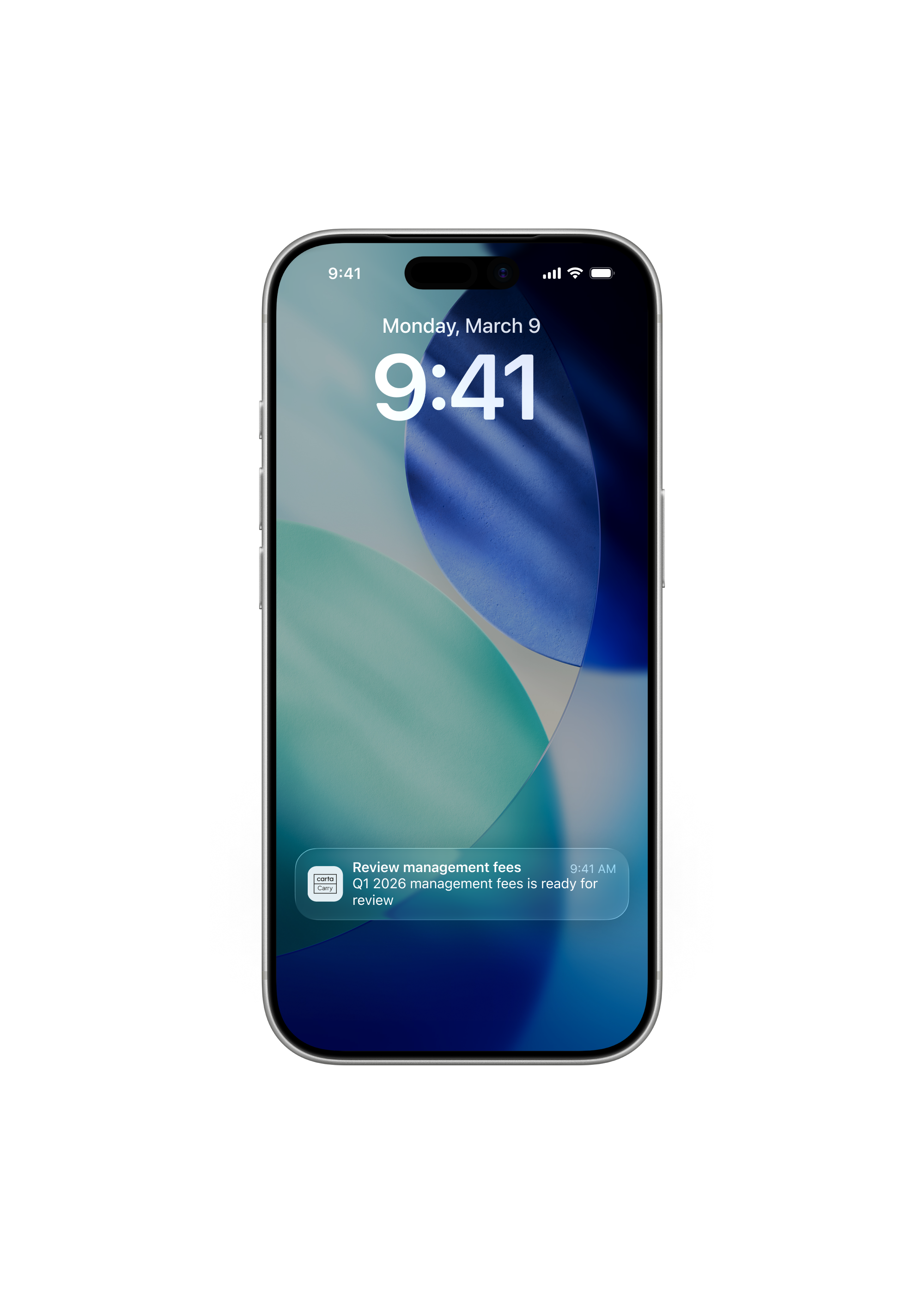
A capital call ready for review, on the lock screen.

A quote from Rishi, General Partner.
Outcome
- Month-over-month retention of active GPs went from 35% in the launch month to 65% by early 2026. Monthly active users grew 40% year over year.
- The usage came from outside the office: airports, travel, hospitals. Approvals moved to mobile.
- Carry became the companion to the web. Heavy workflows kicked off at a desk; status checks and approvals happened on the go.
Internal Carta metrics. Totals are shared credit with the team.
What I learned
Carry got better when I stopped treating mobile as a constraint and started treating it as a different kind of focus. Desktop Carta answers "what is the state of my fund." Carry answers "what needs me right now." And the way to find that out wasn't to design it. It was to ship something bare enough that thirty GPs would show us.